For expert Business Intelligence and Data Visualisation, visit
For expert Business Intelligence and Data Visualisation, visit
But, on this occasion, it's not just about organic search rankings. Whether it's a vision, mobility or hearing disability, or making sure your site works effectively on different devices or browsers; it's about making your site simple for everyone to use.
In 1999 the Web Accessibility Initiative first published the Web Content Accessibility Guidelines (WCAG). These address the issues that many internet users face and, as responsible web developers and business owners, it's what we can do to make life that little bit easier.
There are four main principles the WCAG are organised under: perceivable, operable, understandable and robust. It can feel like a minefield, but we've broken it down into manageable chunks that will help you create a positive user experience and get your site closer to meeting Level AA of the WCAG (2.0).
The use of colour plays a big part in creating an engaging and eye-catching website design; however, taking a moment to carefully consider the colour palette can make all the difference to accessibility and inclusivity.
What should you consider?
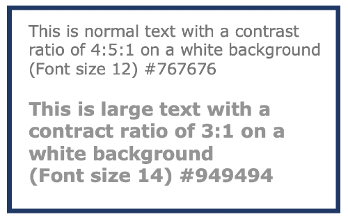 Use plenty of contrasting colours so those with visual impairments can differentiate between information. Low contrast colours are harder to perceive, particularly when it comes to text and the background it sits on. To meet WCAG level AA, all fonts should have a contrast ratio equal to or greater than 4:5:1 for normal-sized text and 3:1 for large text (size 14 /18.66px and above). A useful free tool to guide you is the contrast checker developed by WebAIM, which will analyse the contrast ratio of your forefront and background colours. It's vital to ensure enough contrast between the text and the background so those with moderately low vision can still read the content without contrast-enhancing technology.
A recommendation is that colour should not be the only visual means to convey information, indicate an action or prompt user response. It's best practice to pair colour with an element, for example, a symbol or text, so those who have difficulty distinguishing colours can still understand the information.
It's a good thing to remember that if someone doesn't NEED to see a part of your design or the information you're trying to convey, then why is it there in the first place? Keep designs simple.
A big part of any website is the text, which includes the content, size and style. The text you place on your site is there to capture, engage and inspire your audience. If a user can't read or understand the information you're trying to tell them, it could mean the difference between winning or losing a sale.
What should you consider?
Keep what you're writing easy to understand for people of all abilities. Sometimes using complicated words, unusual phrases, or industry jargon can leave people feeling baffled. If it is not possible to use clear and straightforward language, it might be a good idea to provide definitions.
Add structure to your text and optimise for screen readers. Optimising your content to work efficiently with a screen reader will help users navigate your web pages. The best practice is to use correct heading formats (H1, H2 and H3) instead of a bold typeface to provide a hierarchy and help a reader understand the order of the content.
Another method of optimising for screen readers is to use descriptive alt text. Screen readers rely on alt text to describe out loud the context of an image. Alt text has other benefits, such as boosting SEO and providing a caption if your web page doesn't load correctly. Did you know that most social media providers support alt text on image social media posts?
To meet WCAG Level AA criteria, it must be possible to navigate a website smoothly using a keyboard or keyboard alternative. People with limited eyesight or reduced mobility rely on a variety of assistive technologies, such as screen readers, speech input or sip-and-puff software, or on-screen keyboards. Meaning the layout of your website could impact how these assistive technologies work and cause a negative impact on user experience.
What should you consider?
When planning your page layout, it's essential to navigate sequentially through content. The tab flow should follow the visual flow of pages - left to right, top to bottom: header, main navigation, content buttons, inputs followed by the page footer. The order a user encounters information must be consistent and intuitive. Another consideration is keeping the page length to a minimum. Tabbing through long menus or multiple links can be demanding for people with mobility disabilities, and listening to lengthy links can be draining. Again, keeping it simple is key.
Functionality needs to be predictable for the user to avoid confusion. So, for example, when the user tabs their way through the website page and meets a component that can trigger an event, the keyboard focus must not change until the user acts. The aim is to prevent user control from being taken unexpectedly.
Keep the navigation focus visible. Web browsers provide default Focus Indicators. Usually, a border or lined box highlights the interactive elements as users tab their way through the page. To meet WCAG Level AA indicators are a requirement, and to remove them is a direct violation of the guidelines. You should only remove Focus Indicators if you update the design with something bespoke and more on brand.
Technology has come a long way, and the way we use the internet has evolved. Websites and web apps have become more interactive, and we're consuming content in more creative formats. There are a few watch-outs for presenting this content and making it more accessible for all.
What should you consider?
Form input needs to be clear, concise and accessible to all. Avoid using form placeholder text as a label. I know it's tempting to go with this style to make the form design simple and modern. However, placeholder text is often skipped because a screen-reader will only read the <label> elements on a form.
Video content is becoming one of the most popular ways to consume content on websites and social media. You may have noticed that videos and presentations tend to have captions these days, and it's important you include this on your videos too. The use of captions means that people who have limited hearing abilities can still enjoy the content.
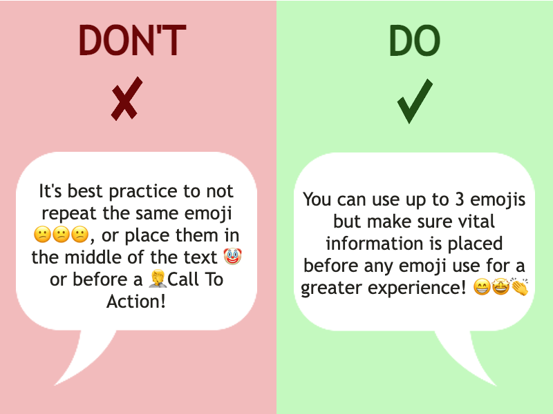
This may seem like a strange one to think about but be mindful of where you place emojis and how many you use. Don't forget screen readers will read out pretty much everything. That cute row of laughing faces would read: "Laughing face of joy", "Laughing face of joy", "Laughing face of joy". As you can imagine, it can be pretty annoying for those using a screen-reader and can interrupt the flow.
Avoid:
Repeating an emoji over and over
Placing emojis throughout a message
Placing a call to action after an emoji can cause it to be missed
Do:
Use up to three emojis if you like. Most blind people get a kick out of the descriptions
Put vital information before the emojis so they're more likely to be heard
Position emojis at the end of a sentence or piece of text to improve screen reader experience
So there is it, just a few of the things you can do to help make the internet a friendlier place for everyone. And to top it all off, don't forget to make your designs responsive, so whatever the device or browser, your users can still enjoy the optimum experience.
Our designers at Formulate Digital follow the accessibility guidelines and design using mobile-first principles, so we know that our websites and applications will be effective and simple for everyone. If you want to read more about the WCAG, you can do so here, but if you need pointing in the right direction or could do with some technical advice, don't hesitate to get in touch.